Collapsible Content
The Collapsible Content section allows you to display content that can be expanded or collapsed, making it easier for customers to navigate through large amounts of information.
Tip
Learn how to open and configure section settings on the Section Settings page.
Section Settings
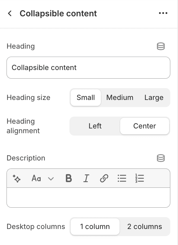
- HeadingEdit the section heading.
- Heading size
- SmallSet the heading size to small.
- MediumSet the heading size to medium.
- LargeSet the heading size to large.
- Heading alignment
- LeftAlign the heading to the left.
- CenterCenter align the heading.
- DescriptionAdd a description for the collapsible content section.
- Desktop columns
- 1 columnDisplay content in one column on desktop.
- 2 columnsDisplay content in two columns on desktop.
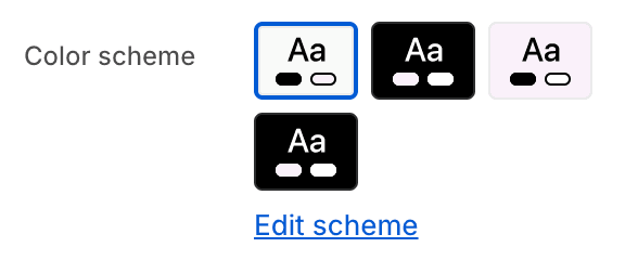
- Color schemeChoose a color scheme for the collapsible content section.
To edit all your theme's colors, including color schemes, go to your color theme settings.
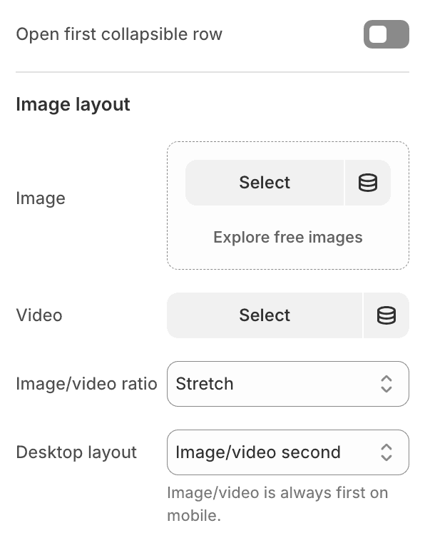
- Open first collapsible rowChoose whether the first collapsible row is open by default.
- Image layoutChoose an image or video in the collapsible content section.This is optional.
- Image/video ratio
- Adapt to imageAdapt the layout to the image's aspect ratio.
- PortraitSet the layout to portrait aspect ratio.
- StretchStretch the image/video to fill the space.
- Desktop layout
- Image/video firstDisplay the image/video first on desktop.
- Image/video secondDisplay the image/video second on desktop.
Section Blocks
Section blocks can be added, removed, and rearranged within sections to provide flexibility in how content is displayed and managed.
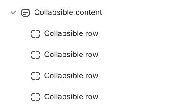
- Collapsible content section blocks:
- Collapsible row (unlimited)
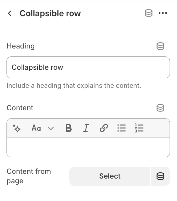
Collapsible row
- HeadingAdd a heading for this block.
- ContentAdd content for this block.
- Content from pageSelect a page to pull content from.