Footer
The Footer section allows you to customize the footer of your store with menus, social media links, text, images, and other elements to enhance the user experience and provide important information.
Tip
Learn how to open and configure section settings on the Section Settings page.
Section Settings
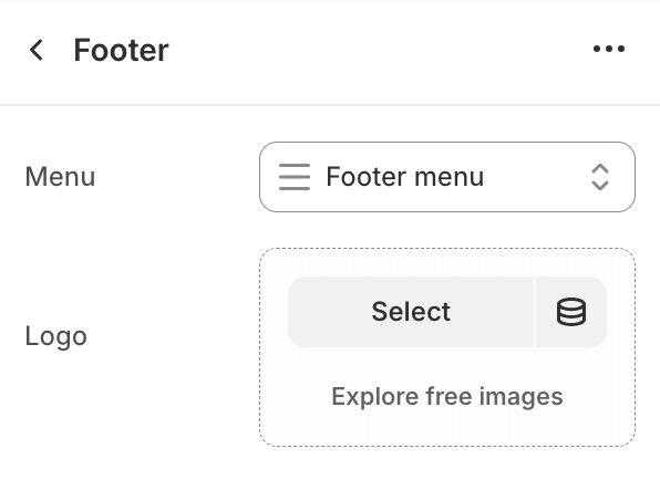
- MenuSelect the menu to display in the footer.
- LogoSelect an image for the footer logo.
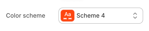
- Color schemeChoose a color scheme for the image gallery section.
To edit all your theme's colors, including color schemes, go to your color theme settings.
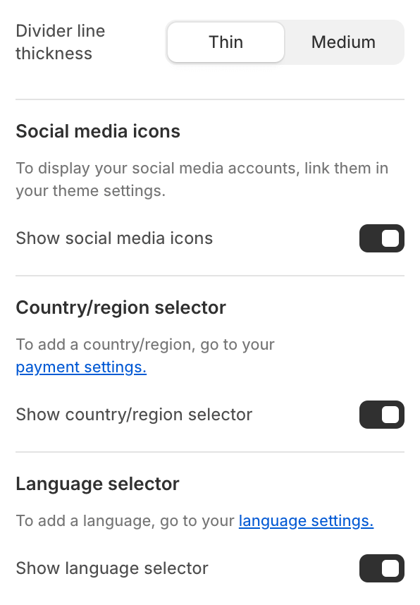
- Divider line thickness
- ThinSet the divider line to thin.
- MediumSet the divider line to medium.
- Show social media iconsShow or hide social media icons.To display your social media accounts, link them in your theme settings.
- Show country / region selectorShow or hide the country / region selector.To add a country / region, go to your payment settings.
- Show language selectorShow or hide the language selector.To add a language, go to your language settings.
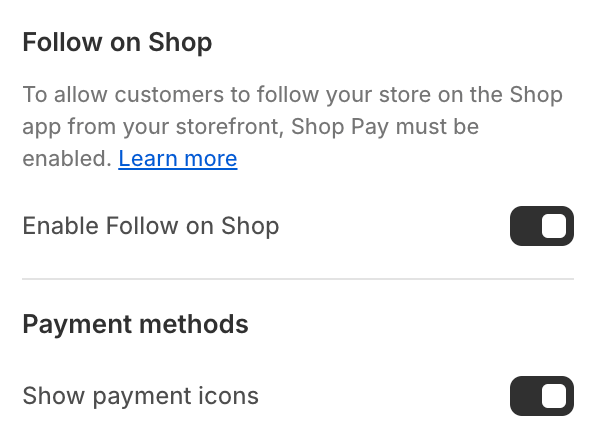
- Enable Follow on ShopEnable / disable the Follow on Shop feature.To allow customers to follow your store on the Shop app from your storefront, Shop Pay must be enabled.Learn more
- Payment methodsShow / hide accepted payment methods.
Section Blocks
Section blocks can be added, removed, and rearranged within sections to provide flexibility in how content is displayed and managed.
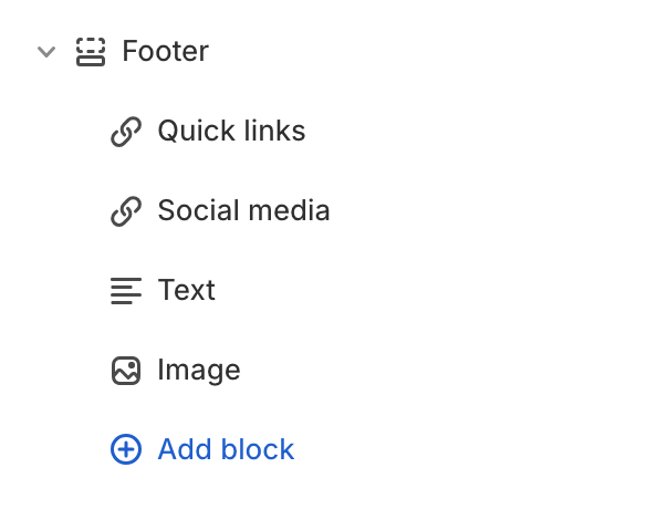
- Footer section blocks:
- Menu (unlimited)
- Social links (1)
- Text (unlimited)
- Image (unlimited)
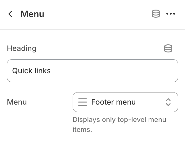
Menu
- HeadingEdit menu heading.
- MenuSelect the menu to display.
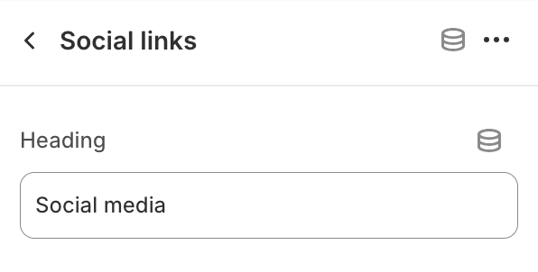
Social Links
- HeadingEdit block heading.
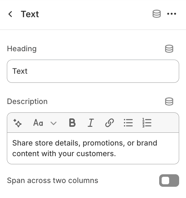
Text
- HeadingEdit block heading.
- DescriptionProvide text content for this block.
- Span across two columnsToggle to span the block across two columns.
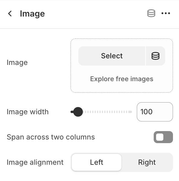
Image
- Image widthSet the image width (default is 100).
- Span across two columnsToggle to span the image across two columns.
- Image alignment
- LeftAlign the image to the left.
- RightAlign the image to the right.