Header
The Header section allows you to customize the top section of your store, including the logo, menu, and various display options.
Tip
Learn how to open and configure section settings on the Section Settings page.
Section Settings
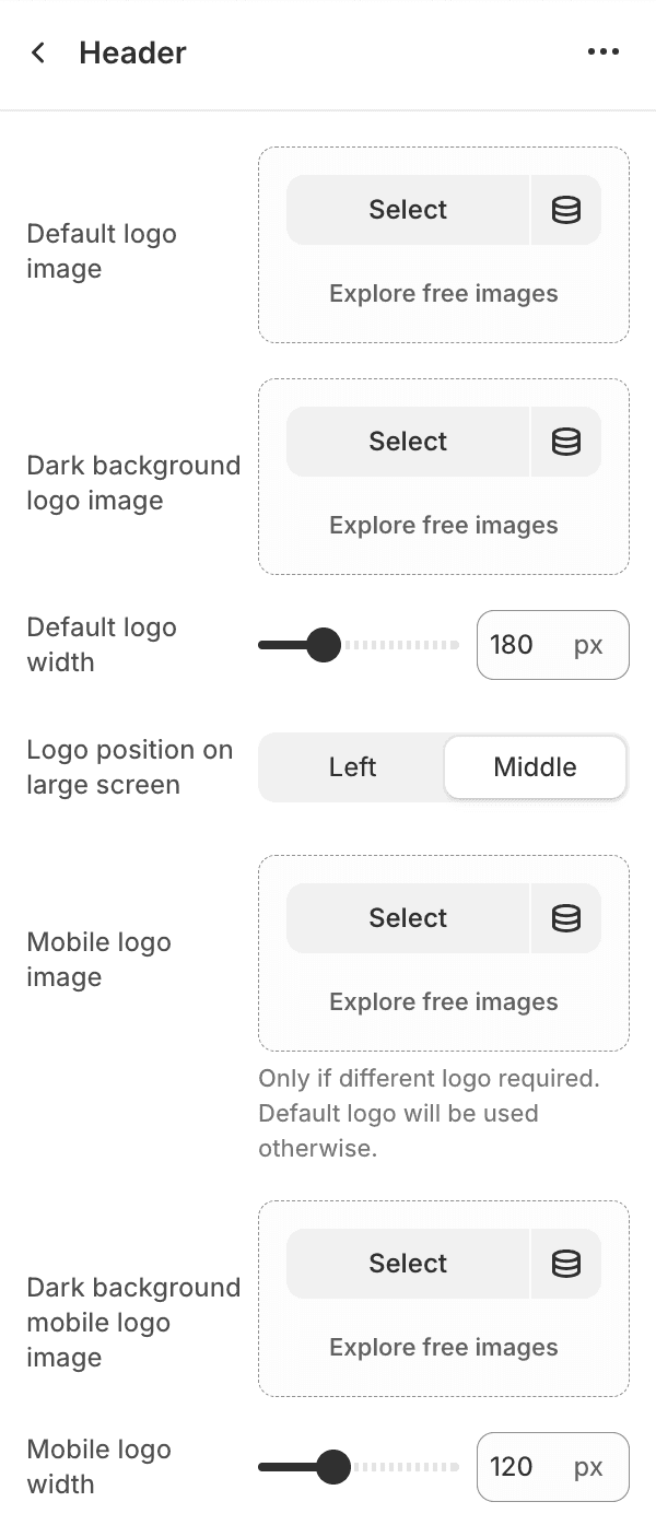
- Default logo imageSelect an image for the default logo.
- Dark background logo imageSelect an image for an alternative logo to appear on dark backgrounds. It's especially useful when "Match banner style" option is on.
- Default logo widthSet the width of the default logo (default is 180px). Your logo is displayed at exactly this width, so upload a file at least as wide as the width you set, or twice as wide for sharp results on high-resolution screens.
- Logo position on large screen
- LeftPosition the logo to the left.
- MiddlePosition the logo in the middle.
- Mobile logo imageUpload an image for the mobile logo. If not provided, the default logo will be used.
- Dark background mobile logo imageSelect an image for an alternative mobile logo to appear on dark backgrounds. It's especially useful when "Match banner style" option is on.
- Mobile logo widthSet the width of the mobile logo (default is 120px). As with the default logo, upload a file at least as wide as the width you set, or twice as wide for sharp results on high-resolution screens.
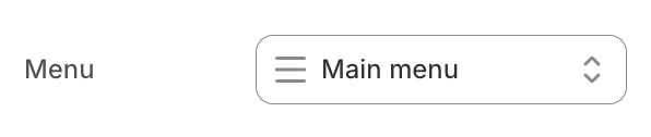
- MenuSelect the main menu to display in the header.
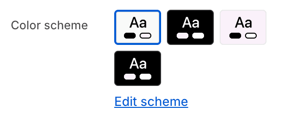
- Color schemeChoose a color scheme for the header section.
To edit all your theme's colors, including color schemes, go to your color theme settings.
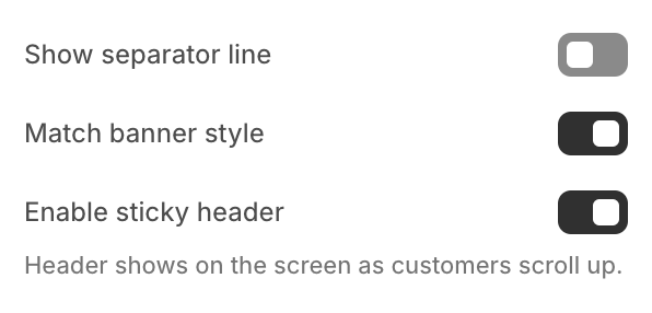
- Show separator lineToggle to show or hide a separator line below the header.
- Match banner styleEnable this option to visually integrate the header with the banner directly beneath it.Applies to the first Image Banner section, Collection banner, and the banner on the page-with-header-banner page template.For the Image Banner section, this effect only applies if the banner is set to full width.
- Enable sticky headerToggle to enable or disable the sticky header feature, which keeps the header visible as customers scroll up.