Custom section
The Custom section is an empty section that you fill yourself. Add headings, text, images, videos, products, collections, buttons and dividers in any order, and group them into rows and columns to build new layouts without touching the code.
Tip
Learn how to open and configure section settings on the Section Settings page.
Section Settings
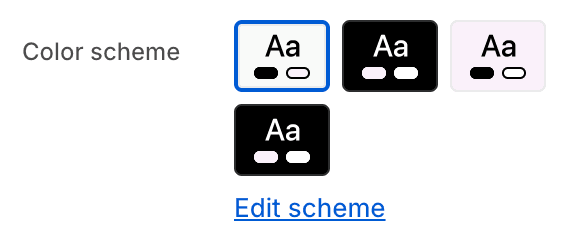
- Color schemeChoose a color scheme for the custom section.
To edit all your theme's colors, including color schemes, go to your color theme settings.

- Make section full widthExpand the section to the full width of the page.
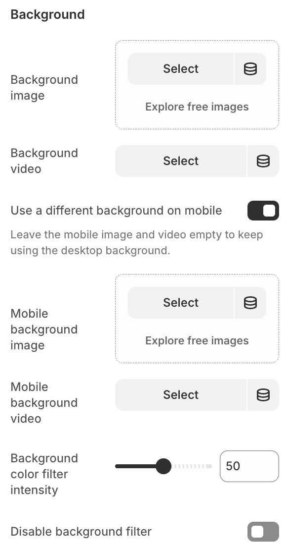
- Background imageUpload or select a background image.
- Background videoUpload or select a background video.Video plays in a loop without sound or controls.Background video overwrites Background image, when both selected.
- Use a different background on mobileA background wide enough for a desktop screen rarely crops well on a phone. Turn this on to choose a separate one.Leave the mobile image and video empty to keep using the desktop background.
- Mobile background imageUpload or select a background image for mobile devices.
- Mobile background videoUpload or select a background video for mobile devices.Mobile background video overwrites Mobile background image, when both selected.
- Background color filter intensitySet the intensity of the background color filter (0-100).
- Disable background filterEnable / disable the background color filter.
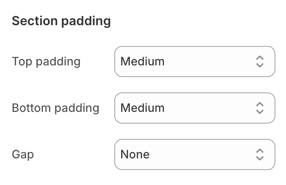
- Top padding and Bottom paddingSizes are multiples of the theme's own spacing, so the section stays in rhythm with the rest of your store.
- NoneNo additional spacing around the section content.
- SmallAdd a small amount of spacing around the section content.
- MediumAdd a medium amount of spacing around the section content.
- BigAdd a large amount of spacing around the section content.
- GapThe space between the blocks inside the section. Sizes are multiples of your theme's own spacing, so the section stays in rhythm with the rest of your store.
- NoneNo space between blocks — they sit flush against each other.
- SmallA tight space between blocks.
- MediumThe default space between blocks.
- BigA generous space between blocks.
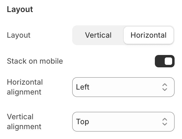
- Layout
- VerticalStack blocks one under another.
- HorizontalPlace blocks side by side.
- Stack on mobileAvailable for horizontal layouts. Blocks placed side by side on desktop stack one under another on mobile screens.
- Horizontal alignmentPosition the blocks across the section: Left, Center, Right or Space between. This also sets how text inside the section is aligned.
- Vertical alignmentPosition the blocks down the section: Top, Center, Bottom or Space between.
Section Blocks
Section blocks can be added, removed, and rearranged within sections to provide flexibility in how content is displayed and managed.
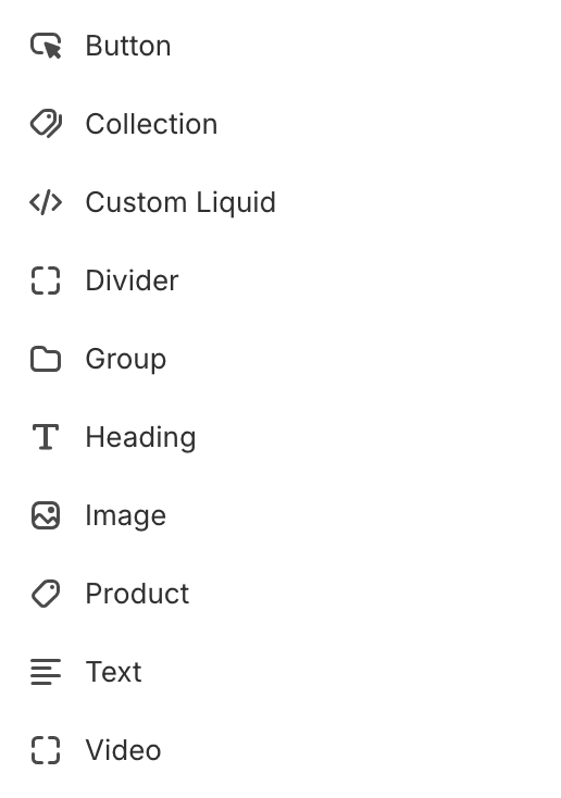
- Custom section blocks:
- Button (unlimited)
- Collection (unlimited)
- Custom Liquid (unlimited)
- Divider (unlimited)
- Group (unlimited)
- Heading (unlimited)
- Image (unlimited)
- Product (unlimited)
- Text (unlimited)
- Video (unlimited)
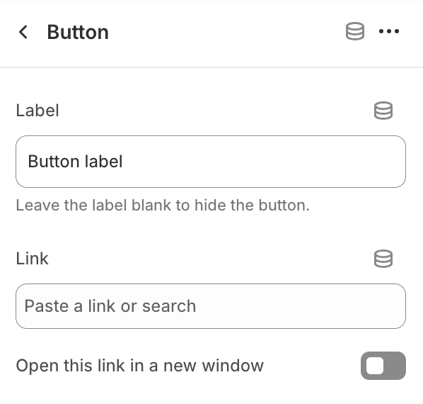
Button
- LabelEdit button label. Leave the label blank to hide the button.
- LinkPaste a link or search for a destination.
- Open this link in a new windowEnable this option to open the link in a new browser window, allowing users to return to the current page more easily.

- Use secondary button styleApply the secondary button style.
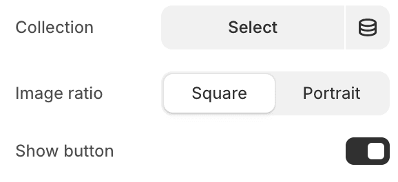
Collection
Shows a single collection as a card. If the collection has no image of its own, the first product image is used.- CollectionChoose the collection to show.
- Image ratio
- PortraitDisplay the collection image in portrait ratio.
- SquareDisplay the collection image in square ratio.
- Show buttonShow a button across the bottom of the card, labelled with the collection name — the same button your collection list pages use.
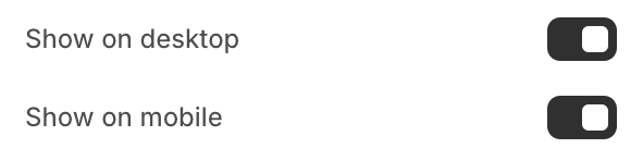
- Show on desktopUncheck to hide the collection on desktop screens.
- Show on mobileUncheck to hide the collection on mobile screens.
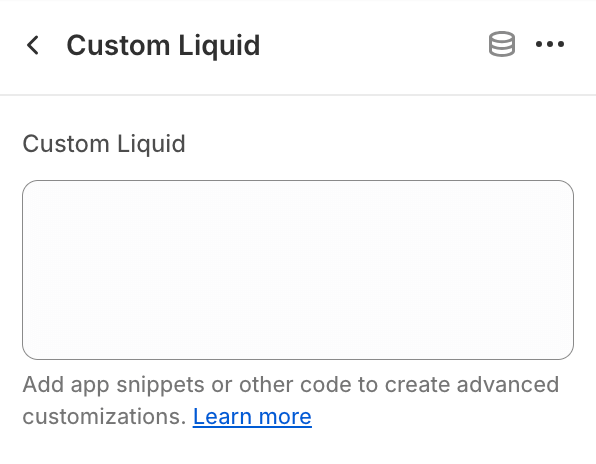
Custom liquid
This block allows to add custom code.Proceed with caution
Only make code changes if you are confident in your skills.
Improper code modifications can lead to unexpected errors, broken layouts, and negatively impact your store's performance and user experience.
If you are unsure, it's best to hire a professional.
Divider
Adds space, a line, or both. In a horizontal layout the line is drawn vertically, separating columns instead of rows.
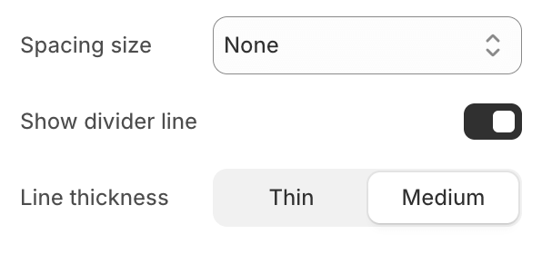
- Spacing size
- NoneNo additional spacing around the divider.
- SmallAdd a small amount of spacing around the divider.
- MediumAdd a medium amount of spacing around the divider.
- BigAdd a large amount of spacing around the divider.
- Show divider lineShow / hide divider line.
- Line thickness
- ThinSet the divider line to thin.
- MediumSet the divider line to medium.
Group
A block that holds other blocks. Use a group to arrange part of your section separately from the rest — two columns of text side by side, or an image next to a heading and button. Groups can be placed inside other groups.
- Color schemeGive the group its own colors to create a band or panel inside the section.
To edit all your theme's colors, including color schemes, go to your color theme settings.
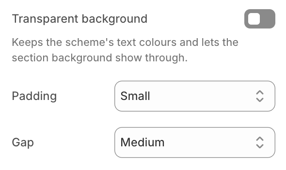
- Transparent backgroundKeep the color scheme's text colors but let the section background — a color, image or video — show through.
- PaddingSizes are multiples of your theme's own spacing, so the group stays in rhythm with the rest of your store.
- NoneNo additional spacing around the group content.
- SmallAdd a small amount of spacing around the group content.
- MediumAdd a medium amount of spacing around the group content.
- BigAdd a large amount of spacing around the group content.
- GapThe space between the blocks inside the group. Sizes are multiples of your theme's own spacing, so the group stays in rhythm with the rest of your store.
- NoneNo space between blocks — they sit flush against each other.
- SmallA tight space between blocks.
- MediumThe default space between blocks.
- BigA generous space between blocks.
- Background imageUpload or select a background image.
- Background videoUpload or select a background video.Video plays in a loop without sound or controls.Background video overwrites Background image, when both selected.
- Use a different background on mobileA background wide enough for a desktop screen rarely crops well on a phone. Turn this on to choose a separate one.Leave the mobile image and video empty to keep using the desktop background.
- Mobile background imageUpload or select a background image for mobile devices.
- Mobile background videoUpload or select a background video for mobile devices.Mobile background video overwrites Mobile background image, when both selected.
- Background color filter intensitySet the intensity of the background color filter (0-100).
- Disable background filterEnable / disable the background color filter.
- Layout
- VerticalStack blocks one under another.
- HorizontalPlace blocks side by side.
- Stack on mobileAvailable for horizontal layouts. Blocks placed side by side on desktop stack one under another on mobile screens.
- Horizontal alignmentPosition the blocks across the group: Left, Center, Right or Space between. This also sets how text inside the group is aligned.
- Vertical alignmentPosition the blocks down the group: Top, Center, Bottom or Space between.
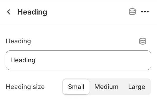
Heading
- HeadingEdit section heading.
- Heading size
- SmallSet the heading size to small.
- MediumSet the heading size to medium.
- LargeSet the heading size to large.
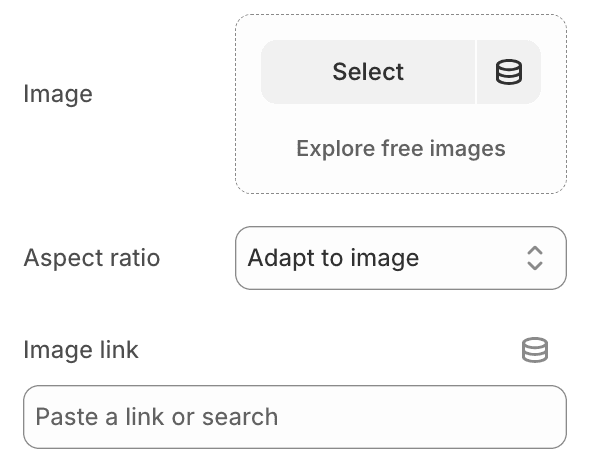
Image
- ImageUpload or select an image.
- Aspect ratioChoose the shape of the media: Adapt to image, 16:9, 4:3, Square, Portrait, 3:4 or 9:16.
- Image linkPaste a link or search for a destination.
- Show on desktopUncheck to hide the image on desktop screens.
- Show on mobileUncheck to hide the image on mobile screens.
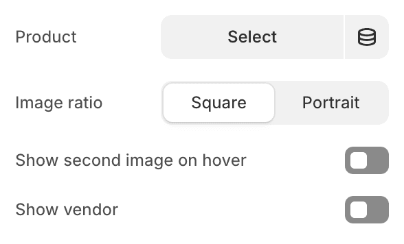
Product
Shows a single product as a card, the same card your collection pages use.- ProductChoose the product to show.
- Image ratio
- SquareDisplay product images in square ratio.
- PortraitDisplay product images in portrait ratio.
- Show second image on hoverEnable to display the second image of the product when hovered over.
- Show vendorDisplay the vendor's name on the product card.
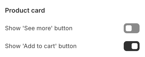
- Product card
- Show 'See more' buttonDisplay a 'See more' button on the product card.
- Show 'Add to cart' buttonDisplay an 'Add to cart' button on the product card.
- Show on desktopUncheck to hide the product on desktop screens.
- Show on mobileUncheck to hide the product on mobile screens.
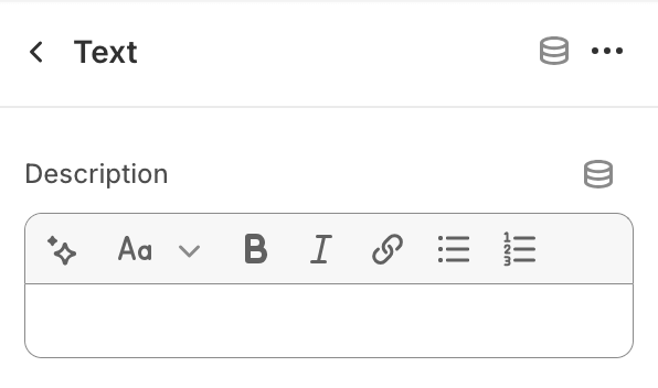
Text
- DescriptionProvide text content.
Video
Takes either an uploaded video file or a YouTube or Vimeo link. If you fill both, the uploaded file is used.
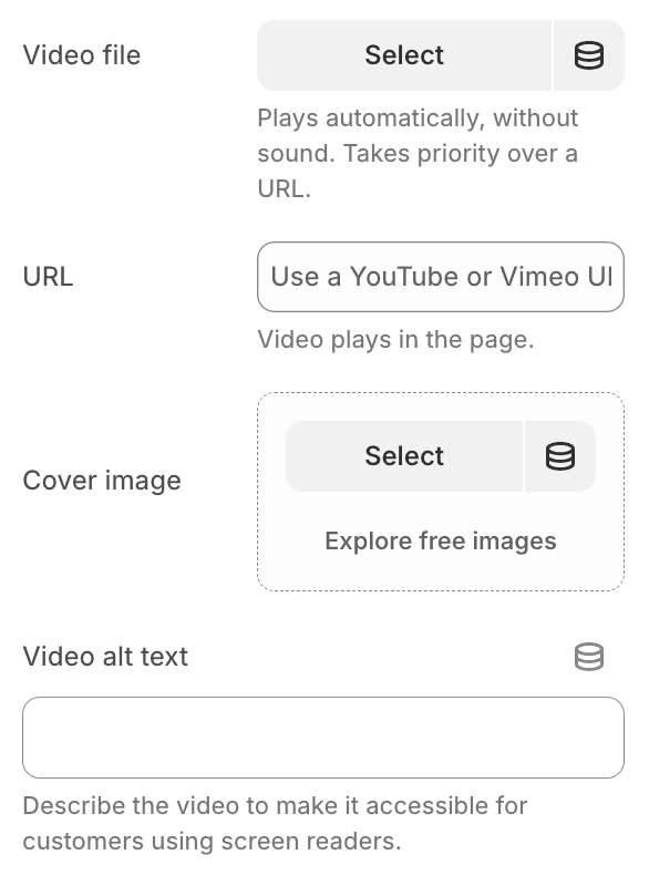
- Video fileUpload or select a video. It plays automatically, without sound, and takes priority over a URL.
- URLPaste a YouTube or Vimeo URL. The video plays in the page.
- Cover imageUpload a cover image for the video.
- Video alt textDescribe the video to make it accessible for customers using screen readers.

- Aspect ratioChoose the shape of the media: 16:9, 4:3, Square, Portrait, 3:4 or 9:16.
- Show on desktopUncheck to hide the video on desktop screens.
- Show on mobileUncheck to hide the video on mobile screens.